
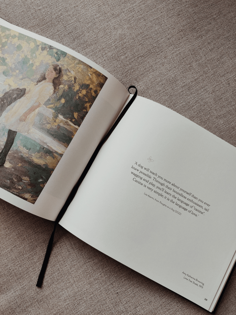
Text: Lisa Azarmi, from Thoughts on a Dog (2022)
Art: Amy Katherine Browning, Lime Tree Shade, 1913
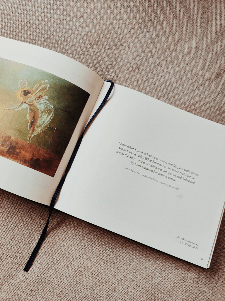
Text: Beatrix Potter, from The Journal of Beatrix Potter from 1881 to 1897
Art: John Atkinson Grimshaw, Spirit of Night, 1879
Since l can remember, art and the written word have both been an integral part of my life. My creative spirit feels instinctively drawn to paintings, poems and transformative quotes.
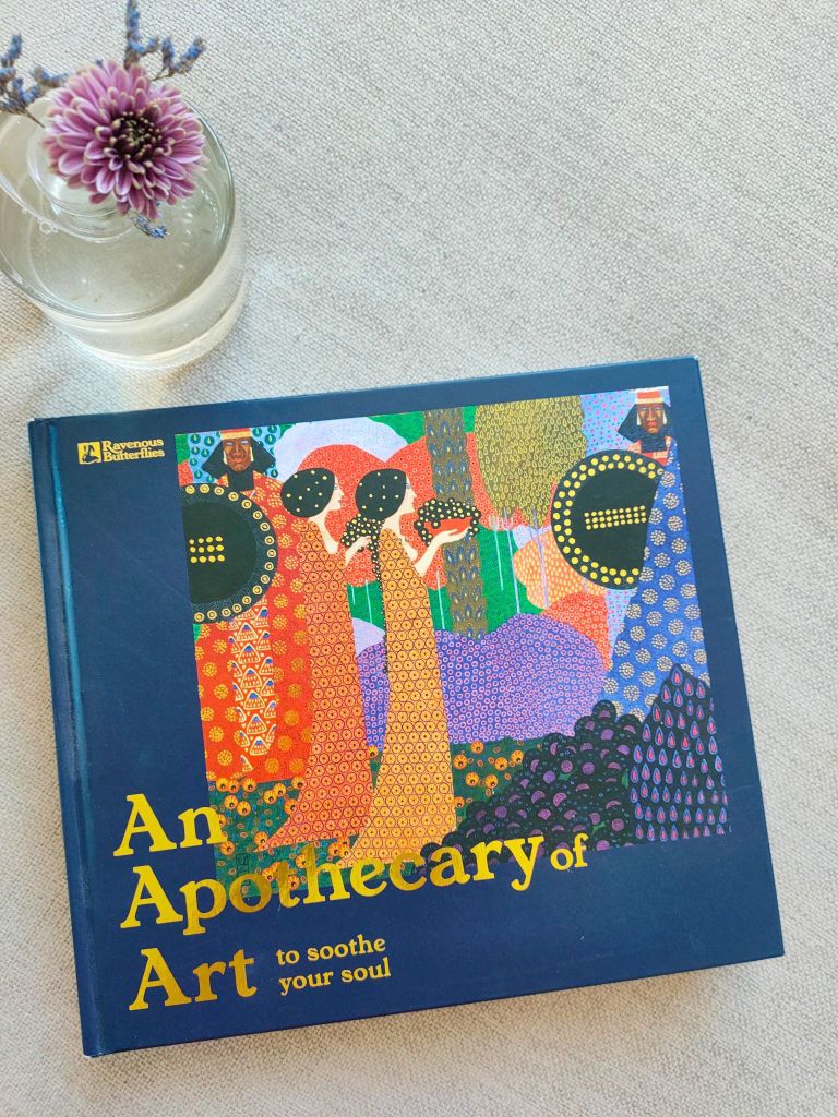
So to be gifted the enchanting An Apothecary of Art to soothe your soul by Ravenous Butterflies is a wondrous treasure of delights for the senses.
It was on a wintry afternoon when l set out to explore this book. With a spirited approach, l closed my eyes and randomly chose a page.
How marvelous to fall on page. 119, an extract from Thoughts on a Dog by Lisa Azarmi, founder of Ravenous Butterflies. Being the doting owner of a furry ball of Goldendoodle energy called Bertie, Lisa’s heart-felt words profoundly spoke to me.
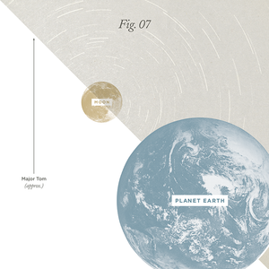
Another joyous highlight, amongst many – Beatrix Potter’s charming reflections on retaining the spirit-world of childhood. Speaking to my inner-child, it completely resonates. The Spirit of Night painting combined with the text makes for the perfect composition.
There are many other notable sections dedicated to a plethora of emotions, which l shall happily leave you to explore at your leisure.
The journey finder in the opening pages, provides a playful navigation, inviting readers to travel, explore, and match emotions to a page – an endearing introduction to the book and its contents.
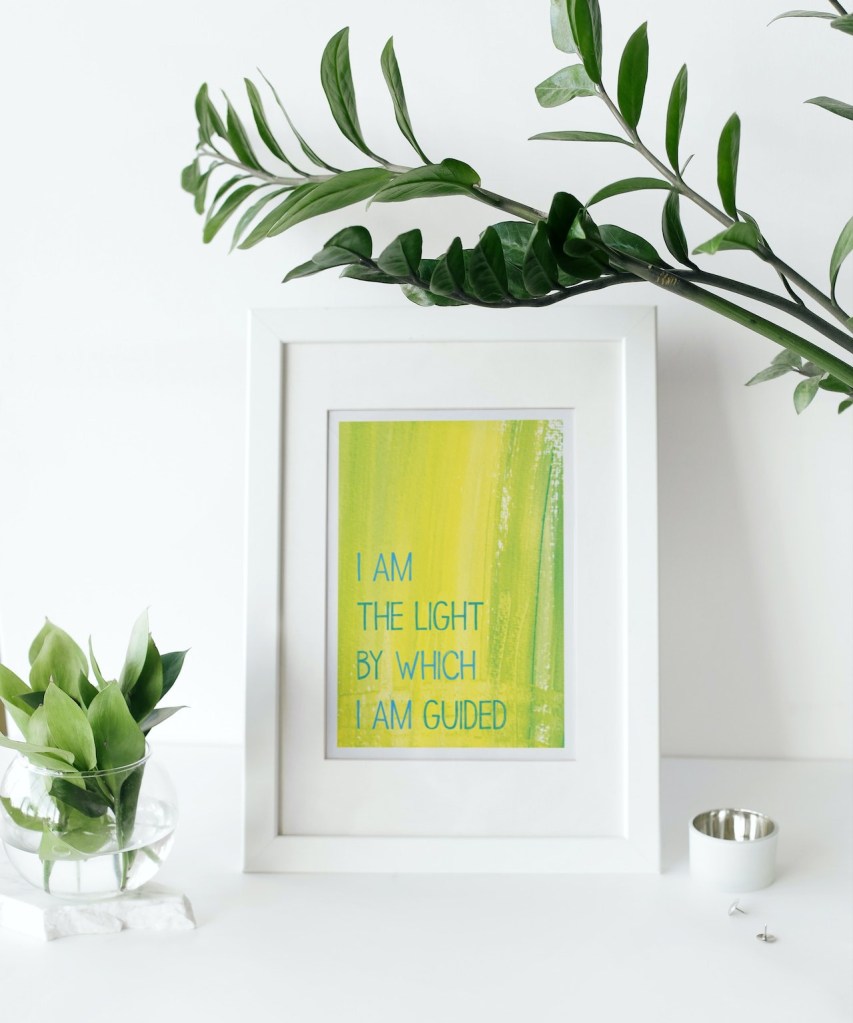
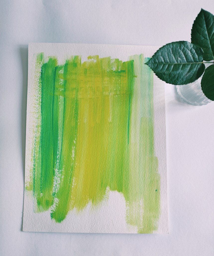
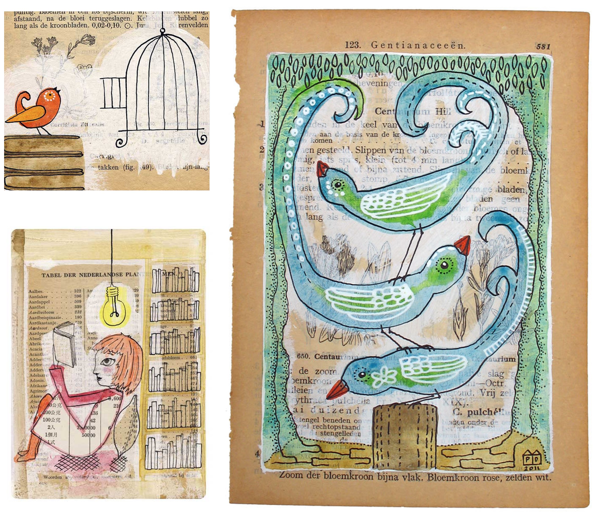
As the book’s introduction beautifully describes, ‘alchemy occurs when the images and text combine’ – An Apothecary of Art richly reflects this magical transformation in abundance.
May this illuminating book light up your path, teach and soothe you as much as it does me.
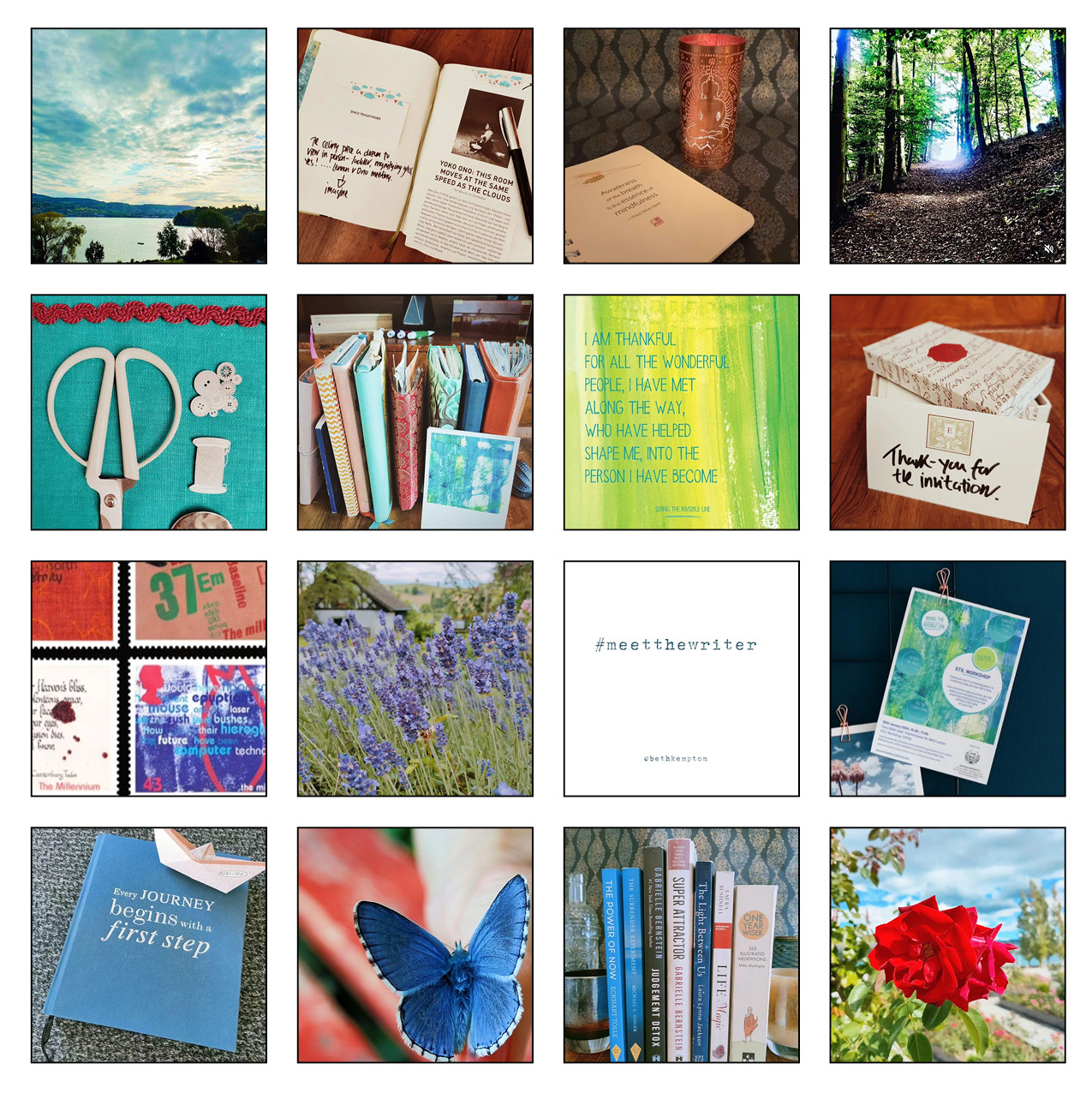
Connect with Ravenous Butterflies
Warm thanks to Lisa for graciously accepting my invitation to share her beautiful book on my Looking Glass, creative inspiration blog. It is a joyous delight to shine a light on this carefully curated collection of art and literature.
An Apothecary of Art content has been shared in this post with kind permission from Ravenous Butterflies.
Photographs: Elizabeth Hitchman