I love Paris in the springtime, I love Paris in the fall…

How charming to travel through enchantingly paper-made Paris!

This exquiste parisian delight was created by artist and designer Joel Henriques – founder of ‘Made by Joel’ Set up as an art & crafts platform, ‘Made by Joel’ encourages us all to explore the playful process of creating.

DIY Animated Walk Through Paris’ and Paper City Paris’ are wonderful examples of how one can simply print out templates, cut & paste a city together, making it come alive via imagination and interactive story-telling. As part of the series, there is even a travel-size version, which fits rather snuggly into a mint box – perfect for amusement en route. l delightfully invite you to explore ‘Made by Joel’ … look out for the ‘Café Wire Sculpture’ and the colourful ‘Paper Circus Rider Toy’.

Happy paper play!
A quote beset with typographic jewels

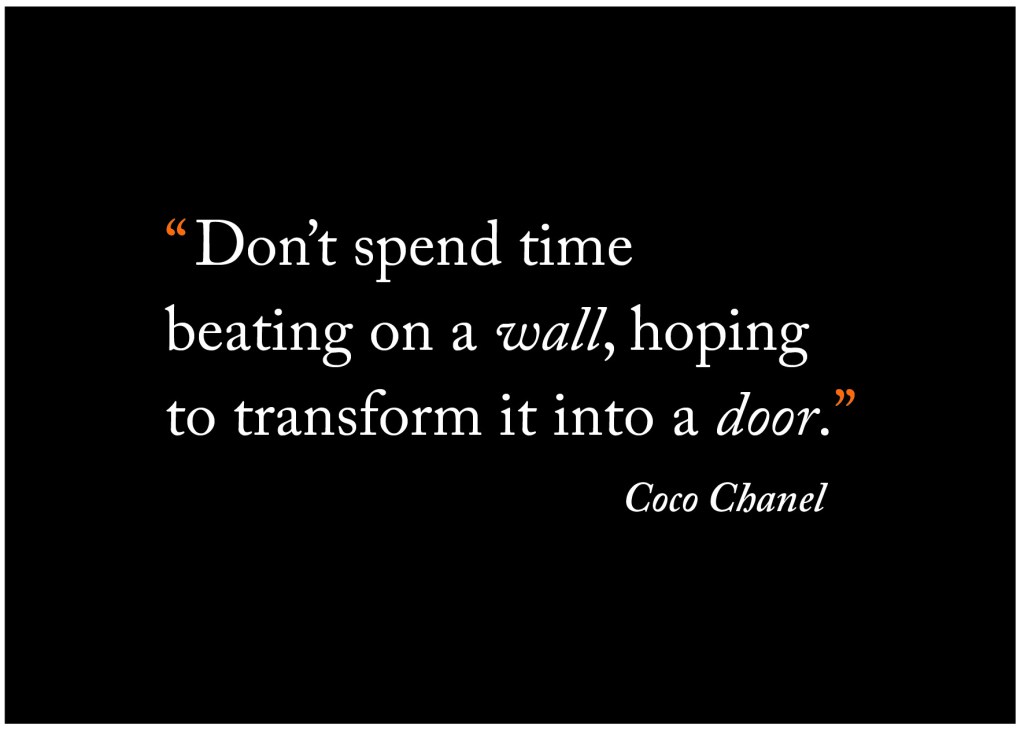
It was an immense pleasure to design a set of materials for a client workshop. One element of the design brief was to create an A6 postcard depicting a quote from fashion & style icon, Coco Chanel.

In homage to the ‘Little Black Dress’, (highly associated with Chanel), it deemed only natural to start with a black canvas. The exploration of typographic language led me to select a serif typeface for the quote, to which l reversed out in white, giving a strong contrast to the solid background.

With a vision of traditional elegance taking shape, further dialogue took place, and the idea of adding a splash of colour was born.

My thoughts soon turned back to Chanel, as l pondered on another quote from the iconic 20th century fashion designer, “Before you leave the house, look in the mirror and remove one accessory“.

Symbolised by orange quotation marks, l visualise the quote as being beset with a pair of jeweled earrings. l wonder if Coco Chanel would view this as wearing just the right amount of accessory?

l’d like to think so.

A picture paints a thousand words

It was whilst reading an online article in relation to the Virgin Short Film Awards, that l came across talented artist, illustrator and designer, Sarah Maycock. The article presented pieces of work by various illustrators, and it was the poster for the Short film ‘Without Saying’ directed by Paul Dingwell that caught my creative eye.

l find Sarah’s authentic style of illustration heart-stirring and richly expressive in the way that the brushstrokes dramatically create a scene. Looking at this particular watercolour illustration, l can instantly feel nature’s elements, with the sea lashing against the harbour wall, and the wind causing the couple to huddle together to keep out the cold – a moment of tenderness, perfectly reflecting the title – ‘Without Saying’.

Naturally, this then led me to explore Sarah Maycock’s website. And what a pleasure to behold! From the broad brownish form of the bear to the elegant fine lines of Virgina Woolf’s portrait, each piece with its emotive brushstroke style tells a story.

Sarah describes her work as “quite chaotic”, and feels the best piece of advice given by a tutor was “if l put one thing in there, that is really crisp and looks like l’ve done it on purpose, then the whole thing will look like l’ve done it on purpose, and not sort of just fallen over near the paper”.

l completely agree, leading me to believe that this train of thought creates an illustrative style that is truly her own.

A typographic wonder

With a pencil, ruler, compass point, stacks of paper, along with a steady hand, Australian based designer and artist Bianca Chang guides her blade, to produce what can only be described as works of pure paper wonder.

Taking typography as the subject matter, Bianca hand plots and cuts stacks of paper to create 3-dimensional typographic compositions forming beautiful patterns and in-depth shadow play.

l feel intrigued by the unique concept of cutting stacked sheets of paper in such a way that allows letterforms to be transformed into fascinating sculptures.

It’s surely a wonder to see the paper medium in all its purity, being treated with such typographic artistic flair!

Whistling the tune of ‘The Bookbirds’

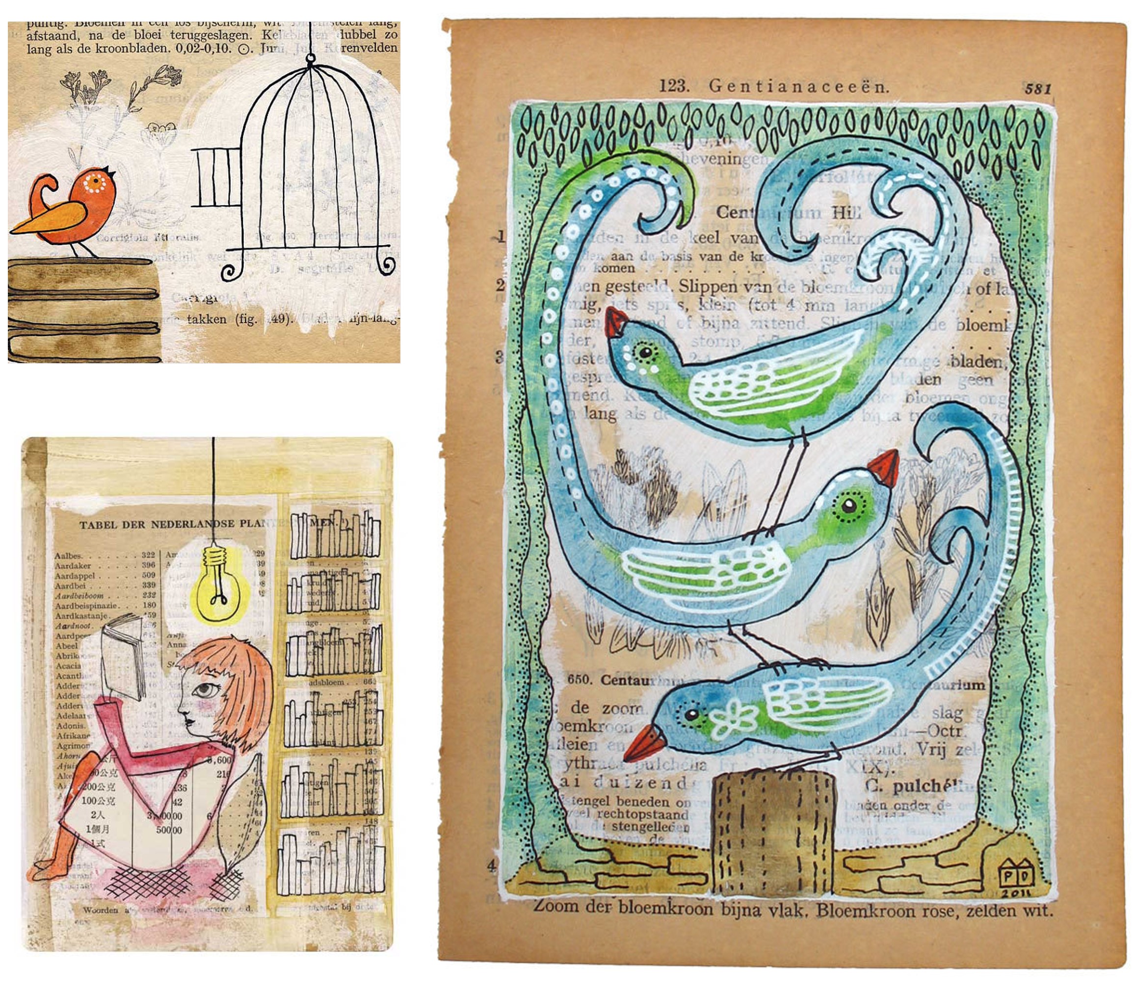
Whether it be laying in the long summer grass, or curled up by a roaring fire during the winter months, reading a book is a favourite past-time of mine.  And so to discover ‘The Bookbirds’ was a moment of pure bliss.

Dutch artist Pia Drent artistically combines her marine biology background with her love for reading – paths which stem from being read to as a child, while growing up by the sea. l find it richly unique to tie these two elements together, in the form of mixed media illustrations.

Taking the vintage book as the canvas, watercolours, acrylics, and inks are applied to the aged paper, creating art that celebates the soothing fusion of nature & reading.

With the digital age in full swing, it clearly feels refreshing to hark back to nature and the nolstagic appearance of the printed word.

It’s an alluring tune, that which belongs to the voice of “The Bookbirds”.

Hanging Up the Moon

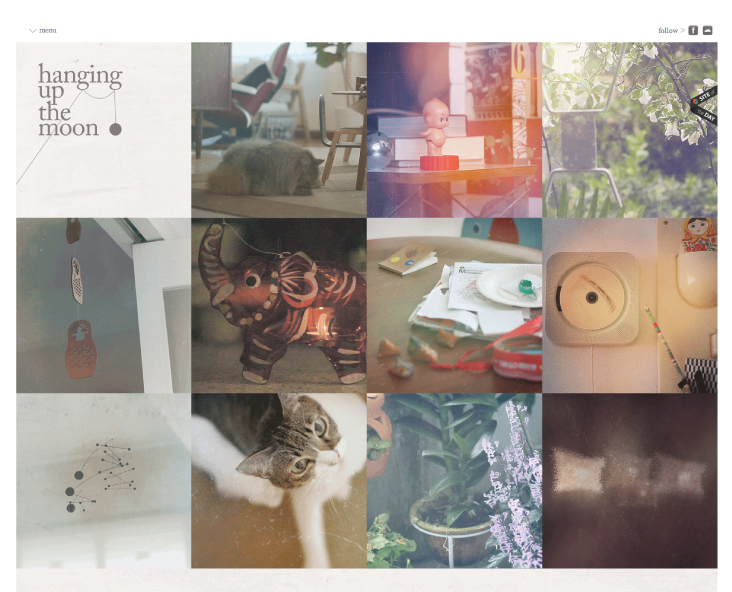
l warmly invite you to embrace Hanging Up the Moon – a music project capturing raw emotion that weaves (consciously, and perhaps even subconsciously) in and out of our lives. The haunting lyrics and folk inspired genre of music, alongside the charming array of visual imagery has surely captured my creative heart!

l feel most fortunate to have discovered the gifted talent of Sean Lam – a rich talent with the musical ability to open minds, bear souls, generate fresh perspectives, and nurture the spirit.

With its authentic approach, and celebration of thoughts unblemished, l feel Hanging Up the Moon gives us the golden opportunity to look again … an invitation to recapture the beauty of our true selves.


Typographic storytelling

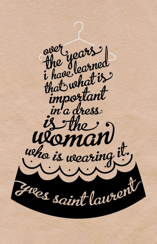
In the world of creative expression where l joyfully reside, typography plays an integral role in my work as a graphic designer. In my mind, these particular two pieces created by Kate and Jimmy Moore of Blimpcat are captivating examples of typographic storytelling.

Taking a quote from the late fashion designer, Yves St Laurent, and shaping the words to form the iconic ‘Little Black Dress’, makes me smile. And the little finishing touch to carefully glide the dress onto the contrasting hanger is attention to detail that is surely noteworthy. l am drawn to the swirl shapes of the chosen typeface, perfectly forming the shape of the dress, and the contrast in type size, which essentially allows the central word “woman” to shine. Lovely!

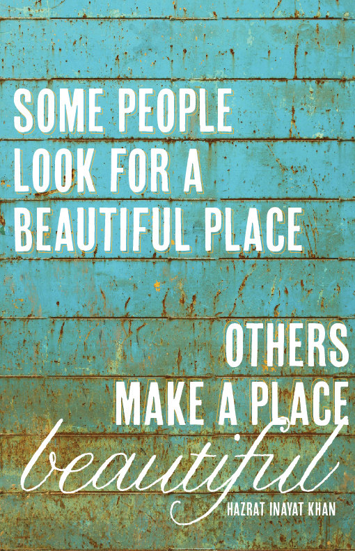
l feel that the other selected piece called ‘A Beautiful Place’  reflects the quote from Sufism teacher Hazrat Inayat Khan, in an organic fashion with rustic charm, its backdrop of natural material – stripping life back to its roots.

l find it poetic how the word Beautiful for the first part of the quote, has been created using uppercase with strength, as opposed to the personal hand-written lowercase approach for the latter part. Thus, visually suggesting it is people which makes a place beautiful – enriched with life flowing through it. It certainly generates food for thought.

Two pieces that speak different languages, each telling a story – a story to make their own.

Surrounding sound of jelly

A concept so thrilling, that l was most delighted when innovative french designer Raphaël Pluvinage kindly accepted my invitation to showcase a piece of his extraordinary work on Looking Glass.

Noisy jelly is a project which l believe, takes the conventional jelly form to an innovative height of exploration, science + design = a visionary playground for all the senses. Each step: filling different shaped moulds with a mix of jelly powder and water, adding colour, allowing to set, carefully placing the jellies onto the soundboard, tapping each jelly to create a unique sound – allows playful interaction in abundance! Who would have thought that chemistry could be so fun.

With much fervor, l welcome you to Raphaël Pluvinage’s inventive world of ideas and boundless possibilites!

Through that which is seen

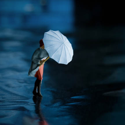
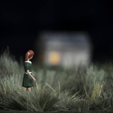
Erin Tyner’s photography series Half Awake, is richly executed in concept and visual. By creating familiar settings within the miniature sphere of dioramas, emotions are open to exploration that may otherwise go unnoticed.

When looking at the individual images, l feel a strong sense of emotive movement. From the lady shielding herself from the elements, to the girl on a walk, whose head ever-so-slightly turns to peer into the lit house in the background. One can almost feel the wind whistling through the grass, pressing against an umbrella, heavy raindrops splashing upon a pavement, or the tension amidst the silence of the night.

Creating scenes that tell a story, evoking emotions via the medium of photography is a craft that Erin Tyner does with a natural flair of sensitivity and understanding.

Be captivated!