“Carrier of valuable messages”

It was through printing talent Rita Nicolussi that my introduction to the communicative charms of Le pigeon voyageur was made. A collaboration (based in Switzerland) between Rita and illustrator Naomi Baldauf, the classical form of high-end stationary is richly celebrated hand in hand with creative illustration and extensive exploration of print production techniques. Their passion for creative ideas and printed form is widely reflected in the attention to detail.

I’ve had the immense pleasure to enjoy a couple of printing conversations with Rita Nicolussi concerning some of the projects created via the Le pigeon voyageur collaboration…the phrase “eyes light up” springs to mind.

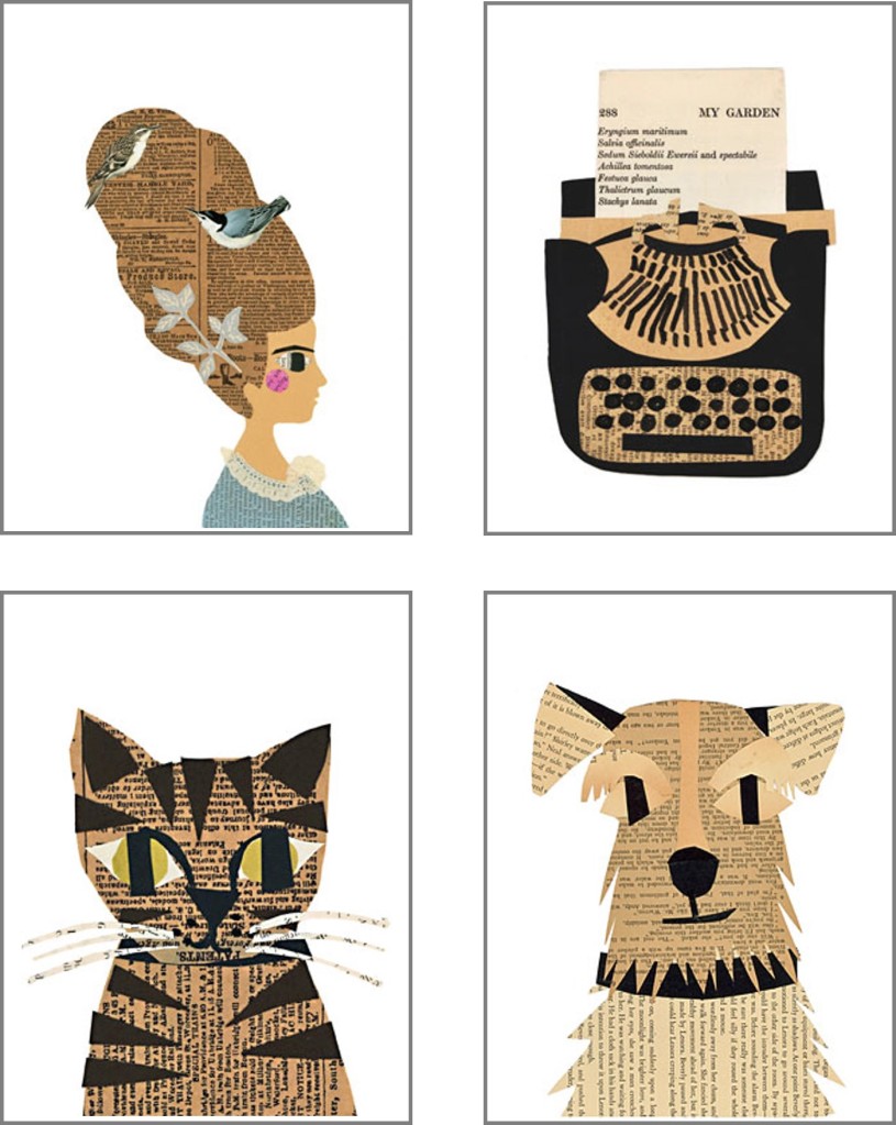
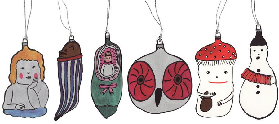
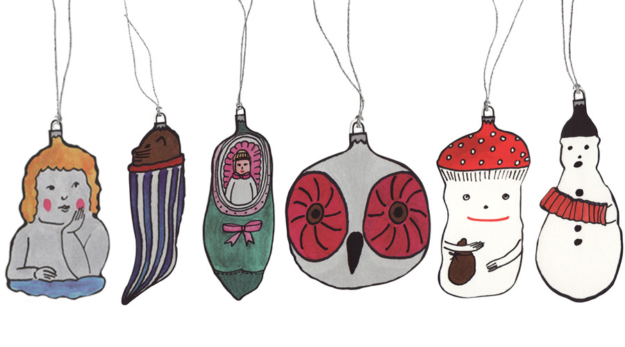
l have been most fortunate to attend the annual printing Messe in Frauenfeld, Switzerland. While visiting Rita Nicolussi and the Le pigeon voyageur exhibition stand, l came across these beautifully illustrated Christmas tags. 

The Snowman imparticular caught my attention, closely followed by the OwlBaby in a shoe and the Mushroom man. l find they make not only lovely gift tags, but also appear rather pretty as a tree decoration. The Snowman has certainly found a new home on my tree.

Le pigeon voyageur retains the delightful pleasure of receiving a hand-written note, and truly is a “Carrier of valuable messages”.

A ‘Nendo’ moment!

Welcome to the world of Nendo! The Nendo objective is to give people a small “!” moment. On discovering Chief Designer Oki Sato and his team’s work, l’ve certainly enjoyed many a moment.

A refreshing feeling evolves when browsing the Nendo website. Looking at everyday objects from a different viewpoint and celebrating the clean, uncluttered form of simplicity truly makes my creative heart sing.

The humble elastic band has been given a shapely, yet robust make-over, a classic set of oil paints beautifully presents itself as an aesthetically pleasing chocolate box (perfect for artists who have sweet tastebuds), and the timeless key calender leads us to the delightful thought of opening new doors on a daily basis.

Simple, effective, and oh so very clever!

Cut and & paste

With an accomplished background in textile and interior design, Denise Fiedler has successfully expanded her exploration of textures to a creative project called ‘Paste’. Re-discovering in 2009 vintage books and flashcards which she had collected over a number of years, Denise came up with the idea to turn these new-found materials into handmade cut and paste collages.

l happily browsed through the visually enchanting ‘paste’ collection, and my eye was drawn to these cleverly constructed paper gems – Marie Antoinette looking most regal yet playful with a couple of colour birds nested in her hairpiece, a beautifully constructed typewriter reminiscent of a bygone era. And a beady green-eyed tabby cat along with a friendly-faced terrier waiting patiently to be adored.

The ‘paste’ dogs and cats wall of fame delightfully nurtures my love for pets and for paper-play.

A typographic celebration of a band

Pearl Jam live in concert, Milan, 20th June 2014.

A date that will remain steadfast in memory. A band that l’ve followed since the release of their debut album ‘Ten’ (1992).

A repertoire steeped in emotive music, richly in-depth lyrics sung with  beautifully haunting baritone vocals…a captivating combination of artistic elements – inspired me to design this typography piece – reflecting music which is weaved into my life´s soundtrack.

Perhaps you’ll discover a Pearl Jam song, that speaks to you…

Thanks to “belle”

It was at the beginning of the year that glassybaby was brought to my attention in the colourful shape of ‘belle’ via the Pearl Jam newsletter (l’m a long-term follower of this gifted band, hence inclusion of “given to fly” ). Upon reading the articles, l subsequently clicked on the related glassybaby link. Lo & behold the glassybaby world came alive.

Founded by Lee Rhodes in 1998, glassybaby’s journey is an inspiring story of courage and hope, in which Lee faced a battle with a rare form of lung cancer. In search of serenity, Lee felt inspired to fill each glassybaby with a tealight, in which she found a shining glow of healing and hope.

l feel greatly touched by the creative manner in which glassybaby spreads the “power of giving” ethos by donating a percentage of glassybaby sales to various charities. A beautiful concept which enables givers to fundamentally change the lives of others.  l also find the creation of names and stories for each glassybaby makes way for an abundance of fun and many glassybaby discoveries.

Following on from my own discovery, it felt only natural to make a ‘Looking Glass Collection’. All six glasses speak to me from a personal perspective. l find a beautiful narrative thread running throughout my carefully chosen pieces. Generating my own sense of serenity, light & hope.

l’m also feeling rather curious as to which unique glassybaby you’re drawn too…

Dot-to-Date your way through the year

What a wonderful way to spend the calender year, plotting your way through British made ´Dot-to-Dot´ – a playful piece, designed by Dan Usiskin. Each design takes a well-known London landmark and invites you to join the dots in your choice of medium. Perhaps you may feel inspired to brighten up Nelson’s Column with an array of coloured crayon derived dots, or for the tactile stitcher, weave colourful threads to join up the dots on the London Eye?

l like the idea of taking an object which helps navigate our schedules, and customizing each month with a moment of creative expression. This calendar will surely enrich the working space.

Dan tells me that due to the global success of the Dot-to-Date London Edition, he has plans in the artistic pipeline to create a World Edition…watch this space…

Force of Nature

It was an immense pleasure to collaborate with artist Sandra Ondraschek-Norris on a book project, drawing together a collection of her landscape paintings. And over the years, l’ve been fortunate to observe Sandra’s work during the various stages of the artistic process. Sandra’s studio is an inspirational sight for the creative eye – a glimpse of a painting in progress (propped up against an easel), has left me on many an occasion with a sense of eager anticipation on being able to view the finished piece.

Growing up on a farm, against the rugged coastal backdrop of County Donegal, Ireland, memories of this changeable seascape proves to be a well of inspiration, inviting Sandra to capture nature’s ebb & flow with her signature style of brushstroke.

Ever reflecting her environment, Sandra’s conversations with nature continues not only with her homeland, but also with the vivid landscape of the Zürichsee (on the doorstep of where she resides), along with the dramatic shape of the nearby mountains.

The design concept for the book itself was to give a sense of “looking through a window “- drawing the reader into the rich, indepth textures of nature. For the biography pages, tonal greens were chosen to give a sense of earthy warmth to the pages. Inside, a solid black background template was created to frame each piece of artwork, allowing the eye to focus on the rich colours of the paintings.

Looking at Sandra’s paintings, leaves me with one final thought …tis a beautiful “Force of Nature“.

*The book can be purchased via the Blurb bookstore.

glass filled with wit

Stepping away from an extensive career in the advertising industry, British-based Andy Poplar now channels his creative talent for word play into the form of witty glass etchings.

As Andy, aptly describes; “The actual name for his brand [vinegar & brown paper] derives from an English nursery rhyme called Jack & Jill in which the character ‘Jack’ falls down and injures his head.He then goes to bed ‘…to mend his head with vinegar & brown paper’ “.

The playful use of words is intricately etched by hand onto the carefully chosen pieces of glassware – an idiom graces a milk bottle, a nod to Alice in Wonderland is beautifully recognised, and a vintage periodic flask is cleverly transformed into a unique Gin & Tonic vessel.

Andy’s latest piece is titled [inwhichhappinesshangs] – A beautifully crafted juxaposition piece – traditional in style, and yet reflects a contemporary message with regards to work and life, which may resonate with most.

l was fortunate to ask Andy where he finds inspiration for his work…”For the work itself – I find inspiration in the myriad of tiny accidental connections that exist in the world – all you need to do is look sideways, with one eye half closed and it’s amazing what you can see”.

Going forward, Andy tells me, “the main focus for next year will be a book of photographs based around a museum filled with a collection of etched glass pieces”.

To which l suspect will be equally measured with just the right dose of creative juices and wit.

Tales of far-away lands & adventure

“La Casuni” is a world where fairytales and imagery of far-away lands leap off the page and enrich the imagination. Born and raised in Rosario, Argentina, Valeria Cis has created a space that merges her talent for illustration with childhood memories of engaging story-telling.

l am captivated by the bold, colourful, surreal style of Valeria’s drawings. And l smiled when l explored the “La Casuni” website. An inviting, delightful space which reflects the fairytale themes with such delicate, whimiscal enchantment.

l can clearly see why the “La Casuni” atelier has generated much global success within the creative realms of illustrating children’s books.

And l do feel a sense of excitement when l glance through the many online platforms which Valeria Cis has joined – sharing her richly illustrative tales of far-away adventure.

Be whisked away…