Christmas creativity

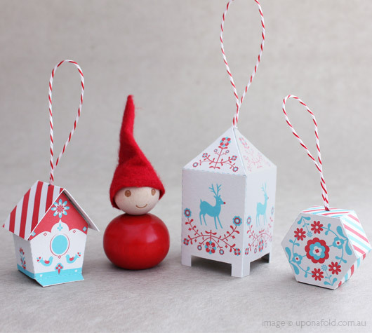
l am feeling rather excited, as the charming lantern decoration that l recently ordered arrived in my mailbox. It’s a much-loved tradition in my household to dress the tree on Christmas Eve, and l’m looking forward to finding a home for my reindeer illustrated lantern decoration amongst the Nordmann fir branches.

l find this collection of Christmas creations happily brings the childs play out of me. l’m going to enjoy cutting, and folding along the lines to assemble my colourful paper ornament.

For now, and on a final creative festive note, l would like to wish you a magical Christmas and an inspirational New Year!

Beauty reflected in miniature


Upon gleefully discovering Canadian born Cybèle Young and her work, l feel immediately mesmerised by her miniature world of art. Utilising paper and etchings, Cybèle creates a world of wonder that can be amusing and thought-provoking in subject matter.

l find her ideas expressed through the delicate texture of japanese paper and illustration full of visual charm and wit. In particular, the two pieces shown here ‘l found it over there’ and ‘We’ll have to change our plans’ captivate the humour and surreal beauty that runs through her work.

l feel inspired by the idea of creating witty pieces of art out of everyday objects!

l believe Cybèle’s art does just that. Enjoy the beauty!


Letterpress finesse!

Having recently completed a birthday visual piece, which celebrated the traditional Letterpress printing technique, l feel an aligned wave of synchronicity to have come across this beautifully designed calendar project from Linda & Harriet.

Based in New York, Linda & Harriet is run by designer Liz Libre & marketer John Libre. The well-loved Letterpress technique is at the heart of their monthly projects, and l find this particular calender idea captures the fine art of the Letterpress form in a visually inspiring manner.

Wellington boots illustrating the month of April! Delightfully quirky and amusing to the eye, which will surely bring a smile to those April showers!

Another aspect of this calender that also makes it fun, is the postcard feature on the back, enticing you to cut and send at the end of each month.

Simply an aesthetically pleasing, interactive and collective piece!

Fashion illustrations with a curious twist

My love for fashion illustration, and tactile objects in the form of fabrics, thread, and ribbon that can be easily kept within a haberdashery box, led me to illustrator, Linda Bennett. Her unique use of mixed media which includes old postcards, textiles and paper, with fashion illustrations lights up my eyes! This vibrant piece called A Modern Curiosity‘ fully encompasses Linda’s passion for fashion and illustration, with its graceful, yet striking presence. l particulary find the colourful 3-dimensional effect inspiring – one can almost touch those beautiful shiny pearls!

With its illustrative 1920’s ‘strike a pose’ – reminiscent of the musical film – ‘Thoroughly Modern Millie’, l feel this work captures the true nature of fashion in a demure and fun-loving way.

A modern twist on a past-time that surely is a curiosity!

Fresh approach to breakfast

Breakfast can only be fun with these beautiful ceramic pieces, designed by Takae Mizutani and sons (sons being her two cats, Mooks & Guiness). l like Takae’s idea of looking at the world with child eyes, which in my mind generates a fresh approach to these everyday products.

The basic egg form has become rather majestic sitting upon its castle throne, and at long last, the humble solider has been elegantly transformed into a valiant hero, as it gallops towards the egg on its royal horse.

As well as being a wordplay on visual communication, my graphic design name ‘Seaglass’ originates from my love of the sea, and so when l came across this playful salt & pepper shaker, l simply smiled. Takae calls this piece ´Memory of Falmouth´ , which l feel is most fitting, as the sailing boat shape takes me back to smells of salty sea air, and endless childhood summer holidays spent along the sandy coastline coves of Cornwall.

A stylish breakfast table that conjours up nolstagic childhood memories – a joy to behold!

Remnants

The Kitchen
Gondal 2010 detail

Last week, l had the pleasure to visit Su Blackwell’s exhibition ‘Remnants’ at the Brontë Parsonage Museum in Haworth, Yorkshire. l was truly overwhelmed by Su’s work. l felt it evoked the spiritual essence of the Brontë sisters and their writing! As children, they would gather round the kitchen fire listening to dark tales of the Yorkshire moors. Wuthering Heights written by Emily Brontë is one of my favourite novels – A tale of love and revenge set against the dramatic backdrop of the Yorkshire moors. Su Blackwell’s piece certainly reflects the haunting atmosphere of this story.

The other piece that l found most enchanting, is ‘Gondal’. This installation was inspired by the Brontës children’s diaries. l find the intricate detail and drama of the piece most compelling as it brings to life the imaginary world of the toy soliders and castles that the Brontë family would escape to throughout their childhood.

Remnants – simply a mesmerising exhibition that l feel requires our attention – become entranced!

The Greatest Show on Earth

As a graphic designer who takes great pleasure in working with typography, l truly admire this entertaining, and dynamic vintage circus inspired piece by Daisy Lew. It reminds me how much fun it is to play with type. Just watch how the acrobatic ‘H ‘ performs an elongated handstand. Ladies and Gentlemen, Boys and Girls, as the circus audience, l accordingly invite you to applaud the Greatest Show on Earth!

Sunflower

It was during my visit to Prague in Spring, that l met the talented fellow Graphic Designer Christina Nelleman. It was our exciting exchange of design and travel dialogue, Christina’s infectious zest for life, alongside her gathering of treasures in different shapes and forms which proved to be the original inspiration for ‘Looking Glass’. l like to think of our meeting, as a beautiful twist of fate, a turning point that has subsequently transformed into an enriching journey…

‘Sunflower’ is the name of Christina’s travelling trailer. l find it charming and quirky, a true reflection of Christina’s energetic spirit – a passion for design, travel and life all rolled into one!

‘Sunflower’ surely inspires me to embrace my own sense of discovery and adventure! Enjoy!

When Wanderers Cease to Roam

WWCTR_June page

l was given this beautiful book by a dear friend of mine as a birthday gift. Having untied the pretty bow, and unwrapped the elegant paper, l found myself immediately bowled over by the spellbinding illustrations and amusing anecdotes.

When Wanderers Cease to Roam – A Traveler’s Journal of Staying Put by Vivian Swift is not simply a journal, or a travel memoir, but a unique reading experience, reflecting personal adventures and the enjoyment of “staying put” within the cycle of a year, from January through to December.

As a designer, l find the hand-written style most visually striking, and have decided to read each chapter month by month…here’s to October – l wonder what monthly treasures are awaiting to be discovered…