Whistling the tune of ‘The Bookbirds’

Whether it be laying in the long summer grass, or curled up by a roaring fire during the winter months, reading a book is a favourite past-time of mine.  And so to discover ‘The Bookbirds’ was a moment of pure bliss.

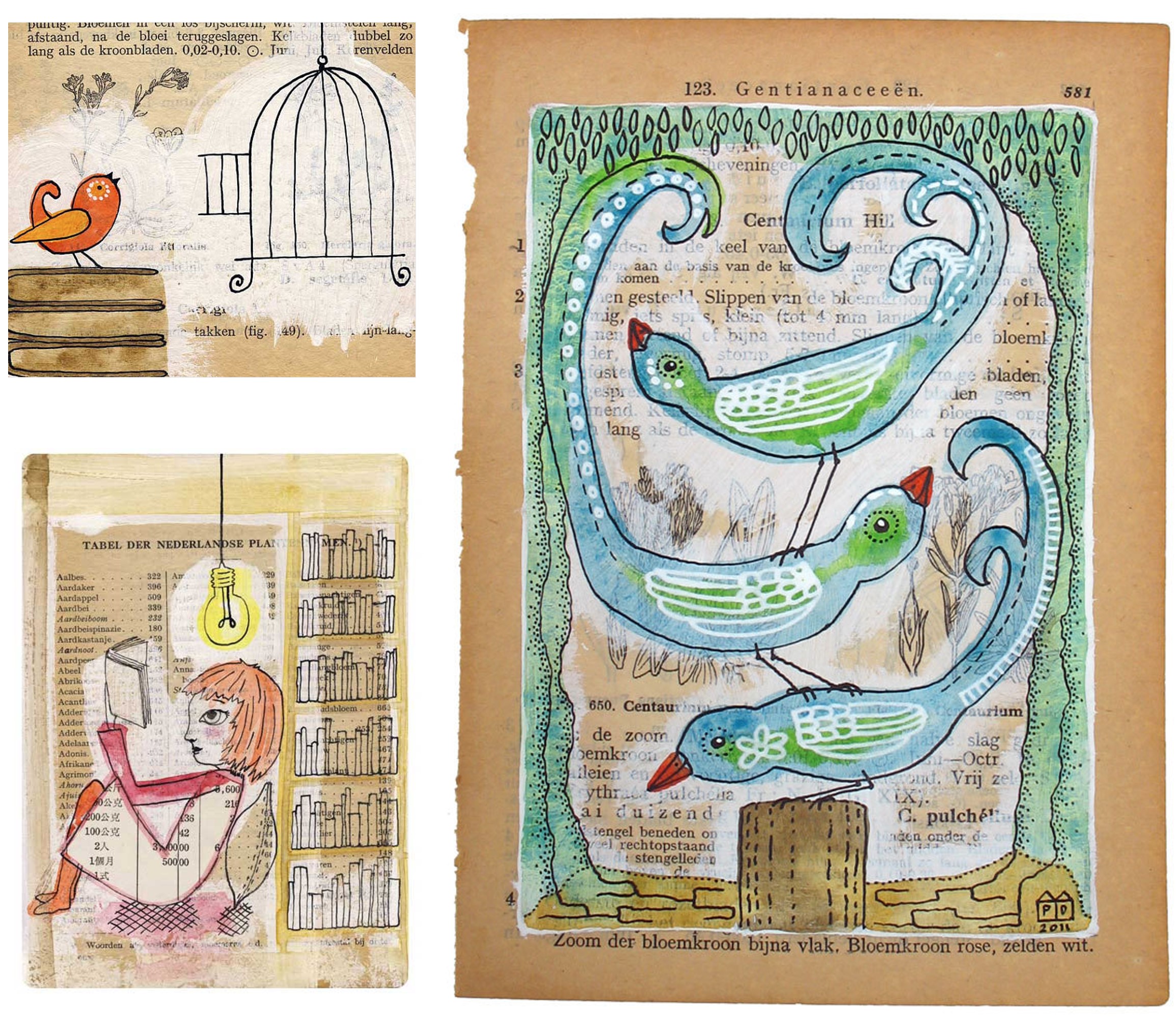
Dutch artist Pia Drent artistically combines her marine biology background with her love for reading – paths which stem from being read to as a child, while growing up by the sea. l find it richly unique to tie these two elements together, in the form of mixed media illustrations.

Taking the vintage book as the canvas, watercolours, acrylics, and inks are applied to the aged paper, creating art that celebates the soothing fusion of nature & reading.

With the digital age in full swing, it clearly feels refreshing to hark back to nature and the nolstagic appearance of the printed word.

It’s an alluring tune, that which belongs to the voice of “The Bookbirds”.

Let’s make some great art

In creative collaboration with Laurence King Publishing, talented illustrator Marion Deuchars has designed a book which fills my sketchbook heart with pure joy!

´Let’s Make Some Great Art´( Kritzeln Zeichen Kunst ) is a drawing playground for children and adults, which in my mind enables us to keep young at heart. This book allows the imagination to run wild – inviting the inner artist to simply have fun making art.

From playful fingerprints, to exploring the technique of artists like Jackson Pollock, l believe realising one’s own artistic expression can open up a whole new world – this book offers such a journey in creative abundance.

l warmly invite you to sharpen your pencil and make your mark…

© 2011 Marion Deuchars

Up, up, and away…

Above it all, Screenprint

Whether it be Dorothy attempting to make her way home from the land of Oz, or the 1956 David Niven film based on Jules Verne’s classic tale ‘Eighty days around the world’, l do find something rather romantic, and adventurous, when it comes to thinking of the hot air balloon.

Freya Cumming has beautifully captured this sense of nostalgic romance and escapism through her vibrant screen print work. The muted colours and choice of pattern screen-printed onto a white canvas generates a sense of adventure reminiscent of bygone days.

Freya’s balloon illustrations also takes me back to a childhood memory of a warm summer’s evening, when l was fortunate enough to view a hot air balloon festival – Layer upon layer of balloon shapes, set against a backdrop of an urban landscape.

Above it all, captures not only this memory, but it also  creates a rich sense of juxtaposition – below, grey lines of architecture, and above it all, a sea of colour. Which in my mind harks back to this idea of adventure & escapism.

Screen-printing is a technique that l hold dear to my creative heart. l fondly recall learning this craft at Edinburgh College of Art, and so l was thrilled to come across Freya Cumming’s work – an imaginative combination of printing technique and subject matter – created with such artistic flair!

l warmly invite you to be taken up, up and away by Freya’s screen-printed hot air balloons.

Falling in love again…

l LOVE to travel, and so when l came across Love Travel Guides by Fiona Caulfield, my heart skipped a beat. Her ethos of embracing a city’s true essence by emerging oneself into the culture is a true reflection of how l also like to travel.

The first book ‘Love Bangolore’ was published on Valentines Day in 2007. Since then Fiona has added to the series with, Love Mumbai, Love Delhi, Love Goa, Love Bengaluru and, Love Jaipur, Rajasthan.

The authencity in which Fiona writes, magically entices me into another culture, and the hand-drawn illustrations, emphatically enrich the reading experience. l feel inspired and enraptured as l explore the hidden treasures of India.

With it’s luxurious design, and cloth packaging, these charming Love Travel Guides are truly created for the luxury vagabond who wishes to fall in love …


A stitch in time

29_jan7
January | 420gsm white watercolour paper | Coloured cotton thread | 420 x 297mm

57_joy4
Joy of Living | 90gsm graph paper | Various colour cotton thread | 297 x 210mm

53_lib2
Liberty – From Regent Street | 420gsm white watercolour paper | Black and Gold cotton thread | 500 x 700mm

Stitching doesn’t immediately spring to mind when one thinks of illustration, which leads me to believe that the work from Peter Crawley gives an impressive fresh perspective on this medium.

Each piece is intricately created by hand piercing watercolour paper with a pin, the paper is then stitched with a needle and cotton thread.

With this knowledge in mind, l carefully considered which images to share on Looking Glass, with the purpose to show each stitch and piece of thread in minute detail.

The varied choice of project, from typographic solutions, to stream-lined architectural structure, is glorious in form and precision. l also adore how the multi-coloured threads become an integral part of the illustration (as shown in the piece ‘January‘). Beautiful!

A particular illustration that instantly caught my imagination, was the piece ‘Joy of Living’, (shown here in the centre of the three visuals). Inspired by the Ishihara Plate test for colour-blindness, the illustration was created as part of a ‘joy of living charity’ project.

“Joy can sometimes feel very distant or become hard to see. However, it is always present and we never lose it, sometimes we just need to look a little harder”. (Quote from Peter Crawley)

Looking with a close eye at the stitched illustrations from Peter Crawley, l would conclude, this to be very true indeed.


Celebrating the delights of Edinburgh

This vivid ‘Edinburgh Skyline’ screen-print by illustrator Kate McLelland joyously takes me back to my halcyon student days spent at Edinburgh College of Art (ECA). l was thrilled to discover that Kate is now studying for her MA in Illustration at this innovative college. l’m truly delighted to have a fellow ECA student join me on Looking Glass!

The rich and opaque colour tones of green and orange capture the magical charm of this vibrant Scottish capital, and l adore the simplistic forms of the famous landmarks, such as Edinburgh Castle and Calton Hill. l can almost hear the playing of the bagpipes, as l view this captivating scene.

l find the style of Kate McLelland’s illustration work bold in shape and colour, which speaks to me in a beautiful contemporary, yet elegant manner. Creating simple clean lines while still retaining an eye for detail.

Beloved Edinburgh, with its nooks and crannies, is a treasured memory, and has become a well of creativity that l will lovingly continue to draw inspiration from.

Fashion illustrations with a curious twist

My love for fashion illustration, and tactile objects in the form of fabrics, thread, and ribbon that can be easily kept within a haberdashery box, led me to illustrator, Linda Bennett. Her unique use of mixed media which includes old postcards, textiles and paper, with fashion illustrations lights up my eyes! This vibrant piece called A Modern Curiosity‘ fully encompasses Linda’s passion for fashion and illustration, with its graceful, yet striking presence. l particulary find the colourful 3-dimensional effect inspiring – one can almost touch those beautiful shiny pearls!

With its illustrative 1920’s ‘strike a pose’ – reminiscent of the musical film – ‘Thoroughly Modern Millie’, l feel this work captures the true nature of fashion in a demure and fun-loving way.

A modern twist on a past-time that surely is a curiosity!