A ‘Nendo’ moment!

Welcome to the world of Nendo! The Nendo objective is to give people a small “!” moment. On discovering Chief Designer Oki Sato and his team’s work, l’ve certainly enjoyed many a moment.

A refreshing feeling evolves when browsing the Nendo website. Looking at everyday objects from a different viewpoint and celebrating the clean, uncluttered form of simplicity truly makes my creative heart sing.

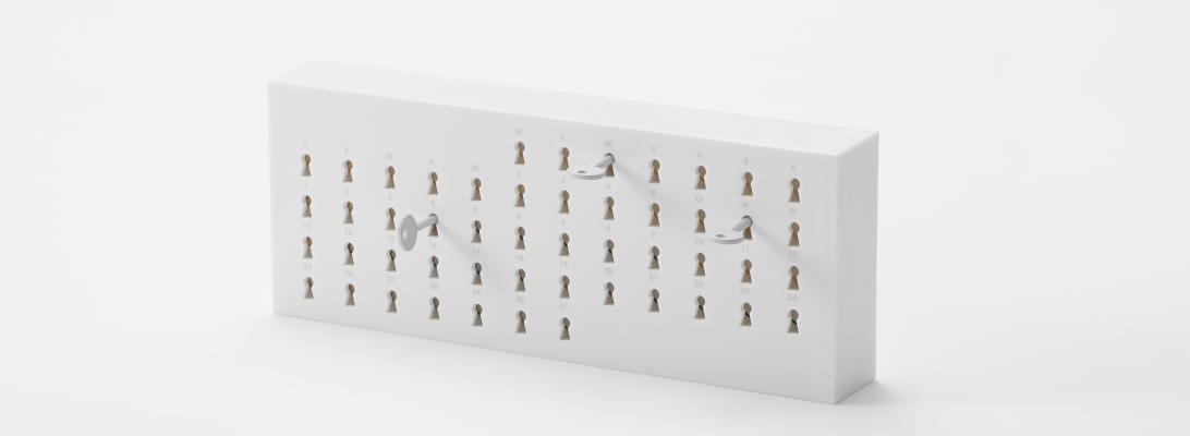
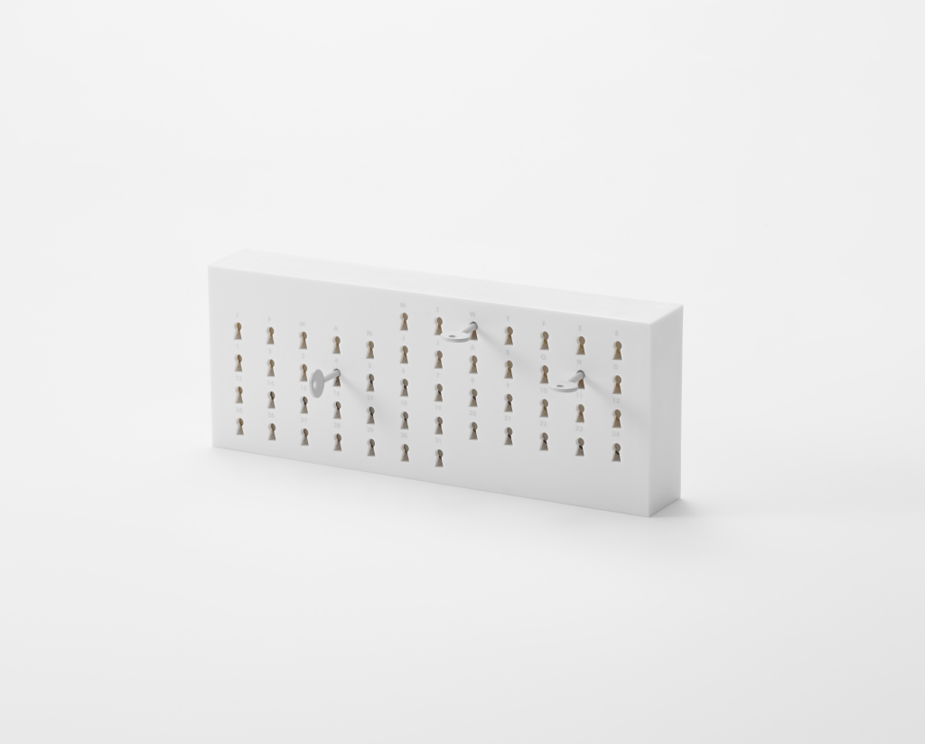
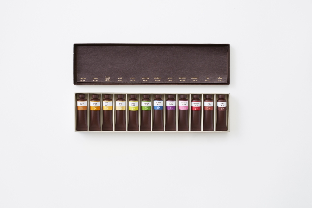
The humble elastic band has been given a shapely, yet robust make-over, a classic set of oil paints beautifully presents itself as an aesthetically pleasing chocolate box (perfect for artists who have sweet tastebuds), and the timeless key calender leads us to the delightful thought of opening new doors on a daily basis.

Simple, effective, and oh so very clever!

Dot-to-Date your way through the year

What a wonderful way to spend the calender year, plotting your way through British made ´Dot-to-Dot´ – a playful piece, designed by Dan Usiskin. Each design takes a well-known London landmark and invites you to join the dots in your choice of medium. Perhaps you may feel inspired to brighten up Nelson’s Column with an array of coloured crayon derived dots, or for the tactile stitcher, weave colourful threads to join up the dots on the London Eye?

l like the idea of taking an object which helps navigate our schedules, and customizing each month with a moment of creative expression. This calendar will surely enrich the working space.

Dan tells me that due to the global success of the Dot-to-Date London Edition, he has plans in the artistic pipeline to create a World Edition…watch this space…

glass filled with wit

Stepping away from an extensive career in the advertising industry, British-based Andy Poplar now channels his creative talent for word play into the form of witty glass etchings.

As Andy, aptly describes; “The actual name for his brand [vinegar & brown paper] derives from an English nursery rhyme called Jack & Jill in which the character ‘Jack’ falls down and injures his head.He then goes to bed ‘…to mend his head with vinegar & brown paper’ “.

The playful use of words is intricately etched by hand onto the carefully chosen pieces of glassware – an idiom graces a milk bottle, a nod to Alice in Wonderland is beautifully recognised, and a vintage periodic flask is cleverly transformed into a unique Gin & Tonic vessel.

Andy’s latest piece is titled [inwhichhappinesshangs] – A beautifully crafted juxaposition piece – traditional in style, and yet reflects a contemporary message with regards to work and life, which may resonate with most.

l was fortunate to ask Andy where he finds inspiration for his work…”For the work itself – I find inspiration in the myriad of tiny accidental connections that exist in the world – all you need to do is look sideways, with one eye half closed and it’s amazing what you can see”.

Going forward, Andy tells me, “the main focus for next year will be a book of photographs based around a museum filled with a collection of etched glass pieces”.

To which l suspect will be equally measured with just the right dose of creative juices and wit.

Surrounding sound of jelly

A concept so thrilling, that l was most delighted when innovative french designer Raphaël Pluvinage kindly accepted my invitation to showcase a piece of his extraordinary work on Looking Glass.

Noisy jelly is a project which l believe, takes the conventional jelly form to an innovative height of exploration, science + design = a visionary playground for all the senses. Each step: filling different shaped moulds with a mix of jelly powder and water, adding colour, allowing to set, carefully placing the jellies onto the soundboard, tapping each jelly to create a unique sound – allows playful interaction in abundance! Who would have thought that chemistry could be so fun.

With much fervor, l welcome you to Raphaël Pluvinage’s inventive world of ideas and boundless possibilites!

The new term starts here…

As we say goodbye to long summer days, and begin to feel the cool breeze of September, l find myself casting my mind back to the childhood days of starting a new school term.

Present & Correct (founded by two graphic designers with a long-term obsession for stationery) charmingly enfuses this concept of going back to school, (or work) with retro flair and classic execution. Here are but afew of their findings, which undoubtedly conjours up many a classroom memory. From simple desk-sets to colourful chalks & boards – all these school-related objects most certainly raise a smile!

l suddenly feel inspired to brighten up my own creative space with a sprinkle of new term magic…

Postcards that come to life

Can you imagine how thrilling it would be to open your postbox, and find one these creative postcards amongst your mail! Created by Anne Paso – founder of Finnish design company Lovi Oy, these interactive pieces of joy, give a refreshing spin to the traditional postcard.

All decorations (in the playful form of hearts, pigs, birds and rabbits) are packaged, complete with string, pre-cut pieces and a set of instructions.

In addition to the quirky and innovative designs, all Lovi products – mainly made of high quality birch ply-wood, are ethically and ecologically sustainable.

On a final environmental note, Lovi have also created a range of ‘easy to care’ trees, (as part of a planting campaign), to which you can hang your decorations, or simply perch a Lovi bird, to welcome in Spring!

A shining light

During these early sun-setting winter days, l believe light can have a positive effect on our well-being. These paper-cut lighting designs created by Hannah Nunn surely generate a warm and welcoming ambiance.

Largely inspired by the botanical world, Hannah creates light in many shapes and sizes – from the classical table lamp, to the whimsical floating fairy light.

In 2005, Hannah set up her own light and craft boutique called Radiance, a treasure haven for all things bright, beautiful and unusual.

l warmly invite you to not switch your main light on until Spring, and immerse yourself under the enchanting glow of these lighting creations!

Fresh approach to breakfast

Breakfast can only be fun with these beautiful ceramic pieces, designed by Takae Mizutani and sons (sons being her two cats, Mooks & Guiness). l like Takae’s idea of looking at the world with child eyes, which in my mind generates a fresh approach to these everyday products.

The basic egg form has become rather majestic sitting upon its castle throne, and at long last, the humble solider has been elegantly transformed into a valiant hero, as it gallops towards the egg on its royal horse.

As well as being a wordplay on visual communication, my graphic design name ‘Seaglass’ originates from my love of the sea, and so when l came across this playful salt & pepper shaker, l simply smiled. Takae calls this piece ´Memory of Falmouth´ , which l feel is most fitting, as the sailing boat shape takes me back to smells of salty sea air, and endless childhood summer holidays spent along the sandy coastline coves of Cornwall.

A stylish breakfast table that conjours up nolstagic childhood memories – a joy to behold!