In creative collaboration with Laurence King Publishing, talented illustrator Marion Deuchars has designed a book which fills my sketchbook heart with pure joy!
´Let’s Make Some Great Art´( Kritzeln Zeichen Kunst ) is a drawing playground for children and adults, which in my mind enables us to keep young at heart. This book allows the imagination to run wild – inviting the inner artist to simply have fun making art.
From playful fingerprints, to exploring the technique of artists like Jackson Pollock, l believe realising one’s own artistic expression can open up a whole new world – this book offers such a journey in creative abundance.
l warmly invite you to sharpen your pencil and make your mark…
My love for making “visual ideas” sketchbooks began during my student days, and it is an activity that continues to nurture my playful and creative spirit.
l tend to start visual thinking in my minds eye, which then leads to carving out my visions onto paper via my A5/A6 sketchbooks. l have started to see my sketchbooks as a journey – a space that evolves over time with the development of ideas – capturing a colourful reflection of a “moment in time”, documenting various moments of my creative path.
It’s always exciting to start a new fresh book with bare crisp white pages, as l never quite know the direction l may go in, and the vibrant forms that start to take shape never ceases to give joy in my quest to quench my creative thirst.
Whether it be a textured piece of paper, a tactile cut of fabric, a charming illustration that perfectly fits a visual that l am creating, or the written word that matches the mood, for a vision that is taking form in my mind…l have fun playing around with concepts, giving them a visual voice that l eagerly seek as an artist/designer – generating a long-lasting piece of “pictorial happiness” for the intended recipient.
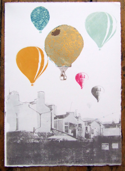
Whether it be Dorothy attempting to make her way home from the land of Oz, or the 1956 David Niven film based on Jules Verne’s classic tale ‘Eighty days around the world’, l do find something rather romantic, and adventurous, when it comes to thinking of the hot air balloon.
Freya Cumming has beautifully captured this sense of nostalgic romance and escapism through her vibrant screen print work. The muted colours and choice of pattern screen-printed onto a white canvas generates a sense of adventure reminiscent of bygone days.
Freya’s balloon illustrations also takes me back to a childhood memory of a warm summer’s evening, when l was fortunate enough to view a hot air balloon festival – Layer upon layer of balloon shapes, set against a backdrop of an urban landscape.
Above it all, captures not only this memory, but it also creates a rich sense of juxtaposition – below, grey lines of architecture, and above it all, a sea of colour. Which in my mind harks back to this idea of adventure & escapism.
Screen-printing is a technique that l hold dear to my creative heart. l fondly recall learning this craft at Edinburgh College of Art, and so l was thrilled to come across Freya Cumming’s work – an imaginative combination of printing technique and subject matter – created with such artistic flair!
l warmly invite you to be taken up, up and away by Freya’s screen-printed hot air balloons.
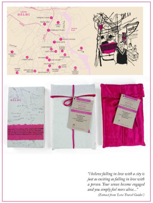
l LOVE to travel, and so when l came across Love Travel Guides by Fiona Caulfield, my heart skipped a beat. Her ethos of embracing a city’s true essence by emerging oneself into the culture is a true reflection of how l also like to travel.
The first book ‘Love Bangolore’ was published on Valentines Day in 2007. Since then Fiona has added to the series with, Love Mumbai, Love Delhi, Love Goa, Love Bengaluru and, Love Jaipur, Rajasthan.
The authencity in which Fiona writes, magically entices me into another culture, and the hand-drawn illustrations, emphatically enrich the reading experience. l feel inspired and enraptured as l explore the hidden treasures of India.
With it’s luxurious design, and cloth packaging, these charming Love Travel Guides are truly created for the luxury vagabond who wishes to fall in love …
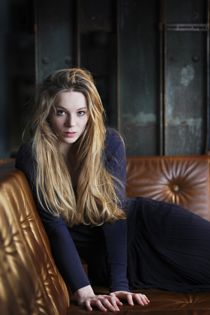
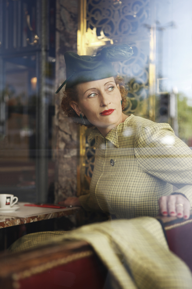
To work with the exceptionally gifted photographer, Justin Hession is an absolute joy! I’ve had the pleasure to commission Justin on several occasions, and he simply has this natural ability to capture the beautiful exuberance of a moment every single time.
When l look at his extensive portfolio of work, l can feel the rich glow of warmer climates, the striking ambience of an interior, or the drama of a city steeped in rich architectural history.
When l study his outstanding portrait photography, l can feel inner beauty, a second glimpse behind the eyes of another human being. l believe it takes a talented gift to capture portraits with such soulful authenticity, and for me Justin Hession has this rare gift in abundance.
Justin Hession can turn a spark into a flame – which in creativity terms, is highly inspirational.
And so without futher ado, I’ll let Justin’s photography do the talking…enjoy!
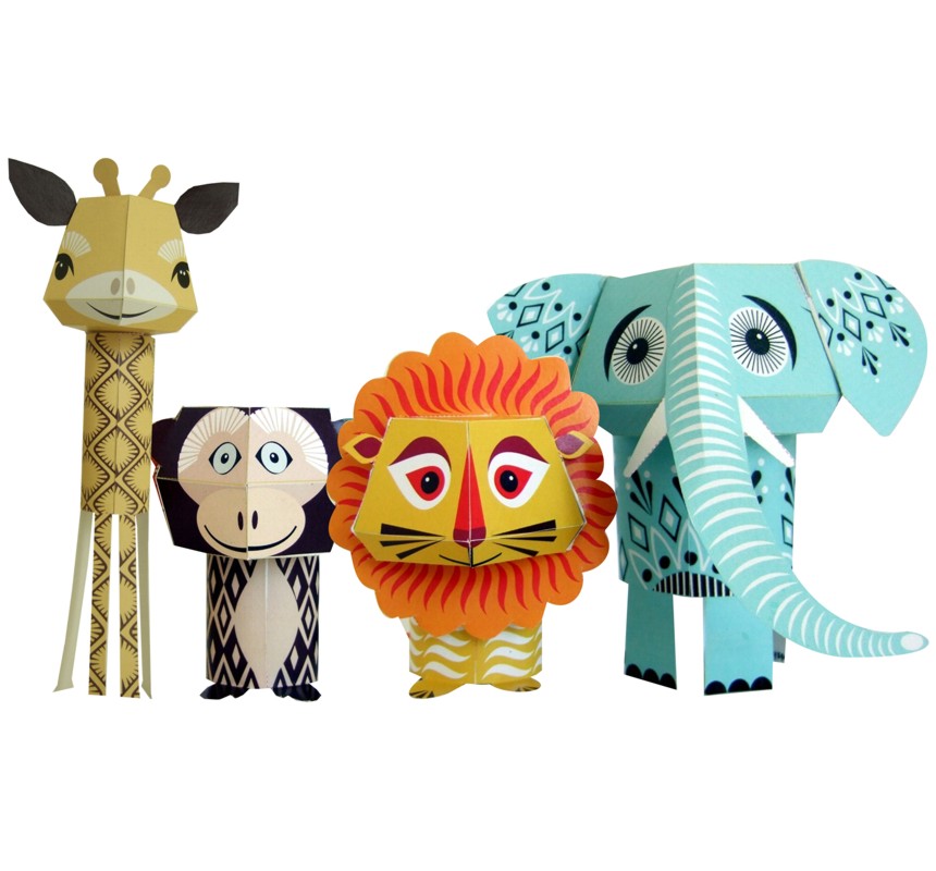
When l look into the big, colourful eyes of these paper animals – aptly named, ‘The Wild Bunch ‘, l can’t help but be amused! Founded by Madeleine Rogers in 2001, Mibo has creatively expanded its original collection of designer lampshades to textiles and paper projects.
‘The Wild Bunch’ is one set out of six paper animal kits that can be purchased, and brought to life with the simple tools of scissors, a ruler and glue.
For as long as l can remember, l’ve been particularly fascinated by the structure and nature of the giraffe. To combine the thrill of assembling an endearing 3-D version of this beautiful creature, and to admire it’s shape and form when completed, truly captures the spirit of paper play.
l for one, am most delighted to learn that Mibo has extended its range of lighting and homewares to paper projects, which l feel will create much enjoyment for children and adults alike.
January | 420gsm white watercolour paper | Coloured cotton thread | 420 x 297mm
Joy of Living | 90gsm graph paper | Various colour cotton thread | 297 x 210mm
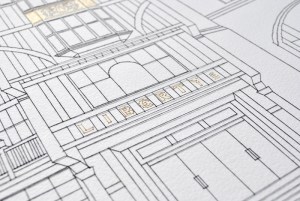
Liberty – From Regent Street | 420gsm white watercolour paper | Black and Gold cotton thread | 500 x 700mm
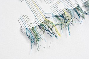
Stitching doesn’t immediately spring to mind when one thinks of illustration, which leads me to believe that the work from Peter Crawley gives an impressive fresh perspective on this medium.
Each piece is intricately created by hand piercing watercolour paper with a pin, the paper is then stitched with a needle and cotton thread.
With this knowledge in mind, l carefully considered which images to share on Looking Glass, with the purpose to show each stitch and piece of thread in minute detail.
The varied choice of project, from typographic solutions, to stream-lined architectural structure, is glorious in form and precision. l also adore how the multi-coloured threads become an integral part of the illustration (as shown in the piece ‘January‘). Beautiful!
A particular illustration that instantly caught my imagination, was the piece ‘Joy of Living’, (shown here in the centre of the three visuals). Inspired by the Ishihara Plate test for colour-blindness, the illustration was created as part of a ‘joy of living charity’ project.
“Joy can sometimes feel very distant or become hard to see. However, it is always present and we never lose it, sometimes we just need to look a little harder”. (Quote from Peter Crawley)
Looking with a close eye at the stitched illustrations from Peter Crawley, l would conclude, this to be very true indeed.
l was thrilled when illustrator, Emma Dibben kindly accepted my invitation to be a part of Looking Glass! I’ve been an avid collector of her food illustrations since being introduced to her work via the magazine publication – Waitrose Food Illustrated.
l find Emma’s “sketch” style of illustration celebrates the seasonal offerings in a warm and welcoming manner, tempting the reader to visit their local market, and purchase fresh produce.
The rendering of additional ink/paint spatterings that accompany the main illustrations, in particular lend themselves to the idea of a much-used cookbook, which l feel adds to the charm of Emma’s work.
A splash of colour, the tonal hues of a fruit or vegetable, and the attention to detail to capture the contours of a herb or leaf, makes these illustrations a mouth-watering experience – bringing them vividly to life!
As a person who enjoys cooking with fresh ingredients, Emma’s drawings, simply inspire me to try my hand at new recipes and techniques. Although, l have to confess, l do indeed have a soft spot for the classical dish – rhubarb crumble with a dash of vanilla sauce.
Spring has joyously arrived, and so on this note, l warmly invite you to taste the culinary delights of April!
Last week’s post inspired me to think about the time spent, studying for my BA in Visual Communication (graphic design) at the innovative Edinburgh College of Art. This set of stamps that l designed as part of an ECA brief, reminds me just how much fun it is to play around with mixed media.
We were able to choose our own subject matter for the “Celebrating the Millennium” four stamp project, and l chose to explore the history of writing. Happily for me, how humanity communicated via drawings, and the written word, opened up a plethora of technique.
The beginning of my journey found me screen-printing hieroglyphs onto linen. l was then most fortunate to commission a calligraphy talent (called David Nash), to take the words from the well-known ‘Canterbury Tales’ by Geoffery Chaucer, who in turn gave them a flourishing twist. l lovingly recall how exciting it was to receive the hand-written piece in the post, which l then later sealed with a dash of candle-wax.
Next port of call, was the much-beloved traditional Letter-press. This was lots of fun, and the final result achieved, was worth the challenge of setting the type by hand!
With the final stamp, it appeared natural to complete the circle. And so by hand-cutting a hieroglyph from tissue paper, which was then layered onto a lino print of blue colour, l then scanned the graphic piece onto my computer to finally implement the “futuristic” based typefaces. It was integral at this point to mix the media as part of the story-telling.
Looking back on this piece of work, l realise once again, how precious it is to nurture traditional techniques, and yet l feel re-juvenated with the realisation, that the past and future can go hand-hand rather beautifully!